
Brand Identity & Logo System
Case Study10th PlanetBurbankLogoIdentity
A refined logo identity and flexible mark system built to improve clarity, hierarchy, and recognizable use across 10th Planet Burbank’s digital and physical brand touchpoints.
Visit Site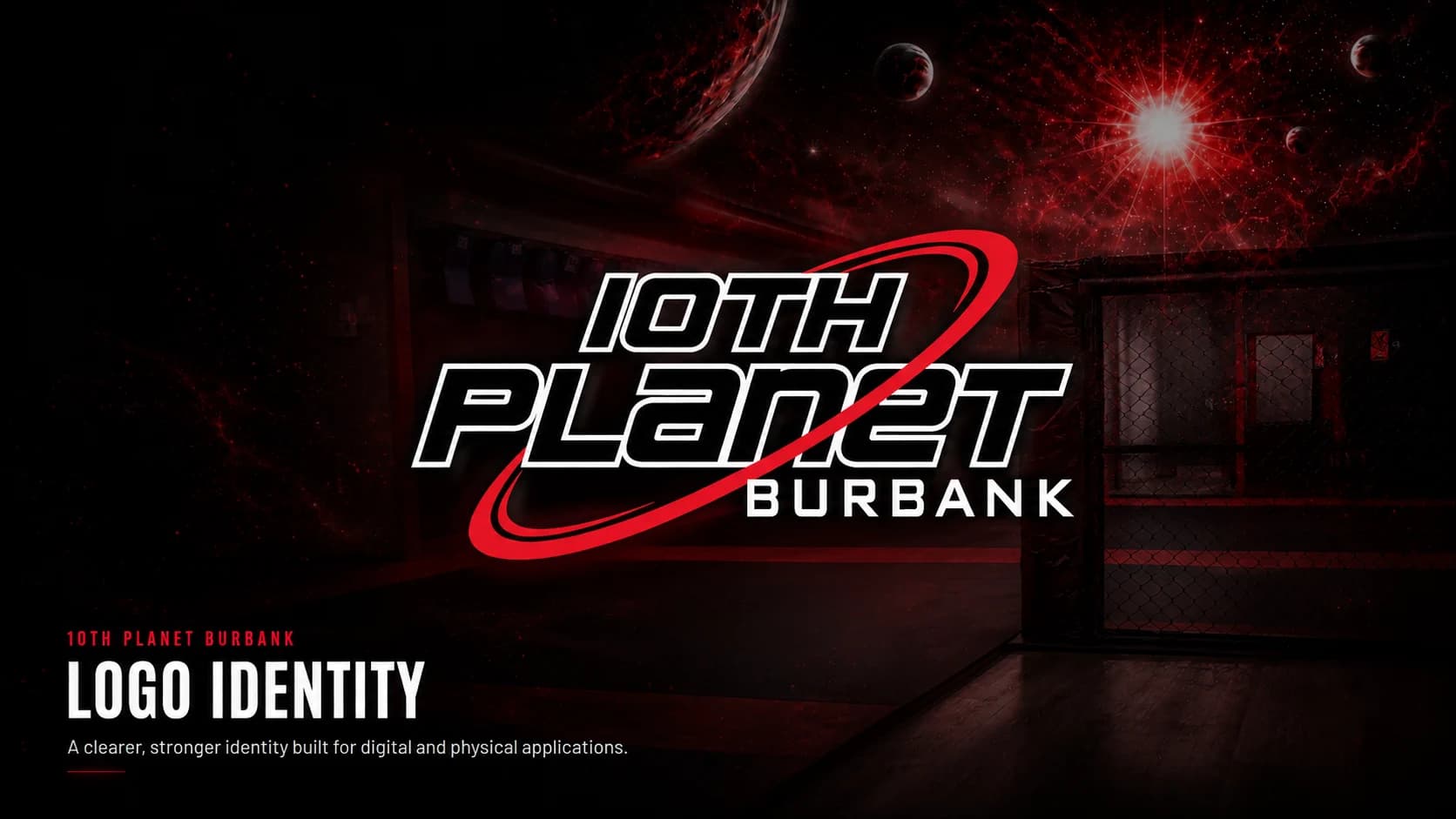
Services
Role
Timeline
Platform
Design Improvement
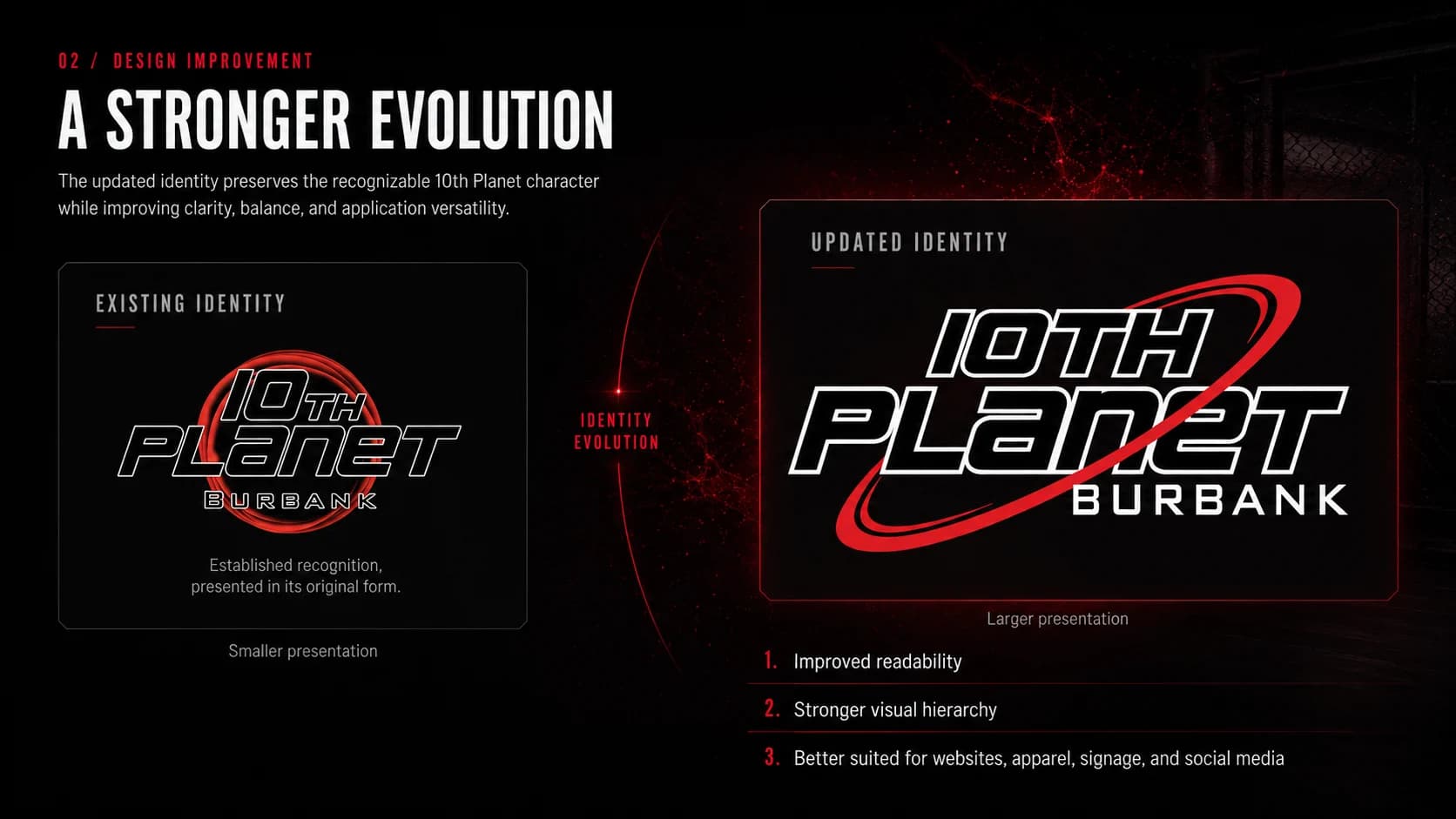
A stronger evolution of an established local identity.
The updated identity preserves recognizable 10th Planet character while improving clarity, balance, visual hierarchy, and versatility across larger-format applications.
Recognizable Evolution
The update retains established recognition while refining the mark’s presentation.
Clearer Hierarchy
The wordmark and Burbank location identifier have a more deliberate relationship.
Broader Use
The system is designed for clearer use across digital and physical formats.
Design Logic
An integrated brand mark built for recognition, motion, and hierarchy.
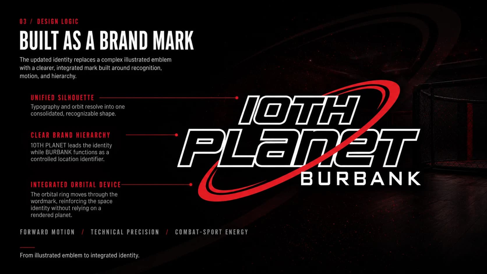
The identity replaces a more complex illustrated emblem with a consolidated silhouette: an integrated wordmark, a controlled Burbank location identifier, and an orbital device that reinforces movement and technical precision.
Unified Silhouette
Typography and orbital form resolve into one recognizable mark.
Location Hierarchy
Burbank remains a controlled local identifier within the identity.
Orbit Device
The red orbital ring reinforces forward motion without relying on a rendered planet.
Logo System Variants
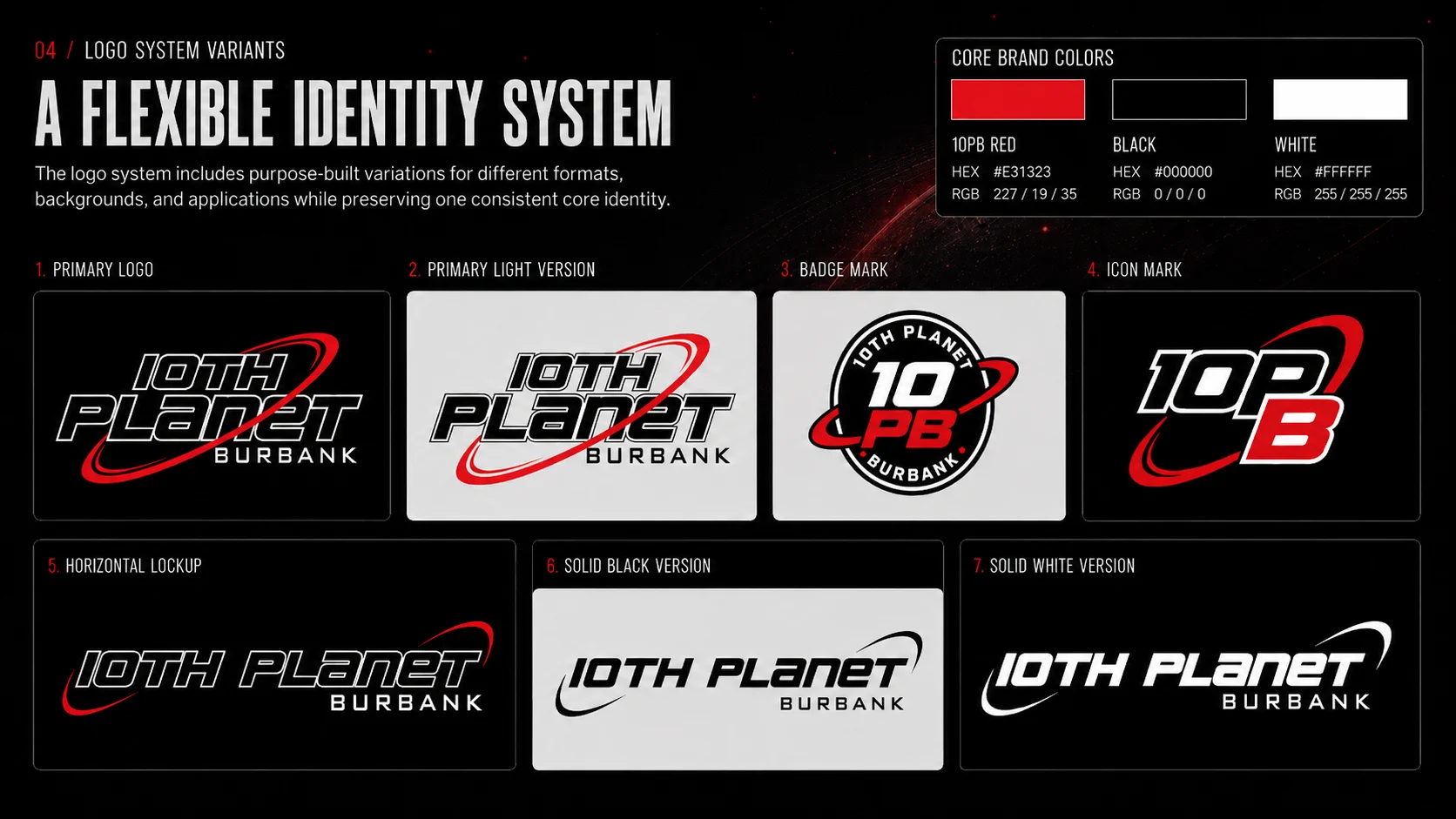
One core identity, purpose-built for different formats and backgrounds.
The system includes primary, light, badge, icon, horizontal, solid-black, and solid-white variations so the mark can remain recognizable across distinct placements and production constraints.
Core Colors
10PB Red, black, and white provide a disciplined identity palette.
Format Flexibility
Primary, badge, icon, and horizontal marks suit different proportions.
Production Readiness
One-color versions support lower-complexity reproduction.
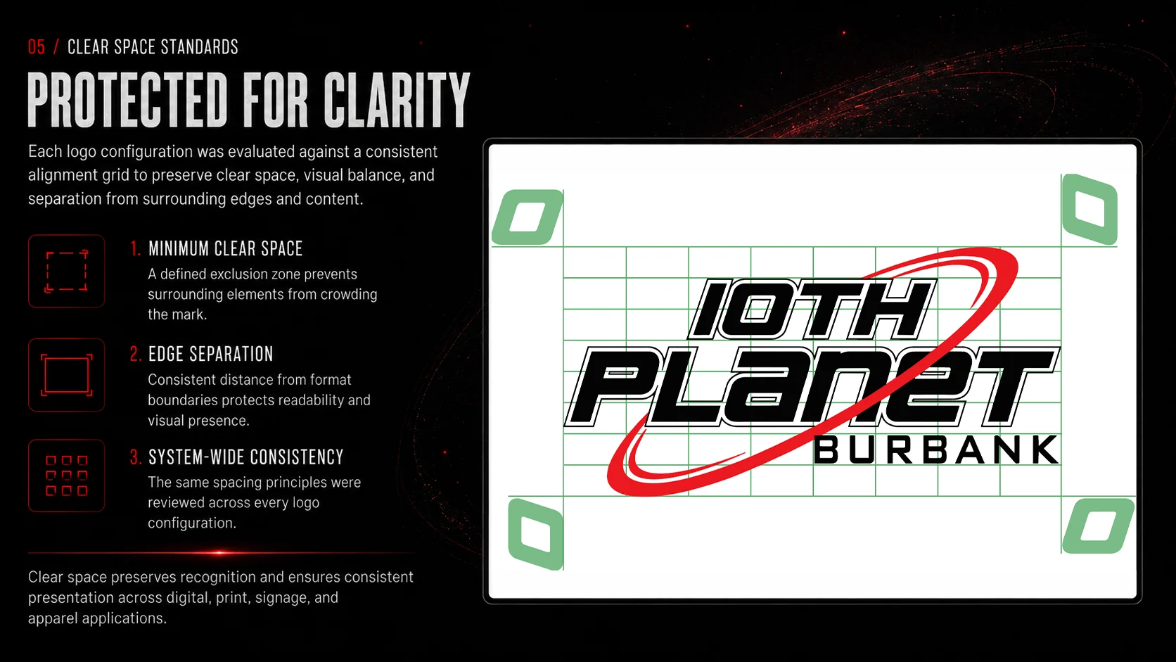
Clear Space Standards
Usage standards designed to protect recognition and clarity.
Clear-space and edge-separation guidance gives the logo system a consistent exclusion zone around surrounding content, format boundaries, and competing visual elements.
Minimum Clear Space
An exclusion zone keeps surrounding elements from crowding the mark.
Edge Separation
Spacing from format boundaries preserves readability and visual presence.
System Consistency
The same principles apply across each logo configuration.
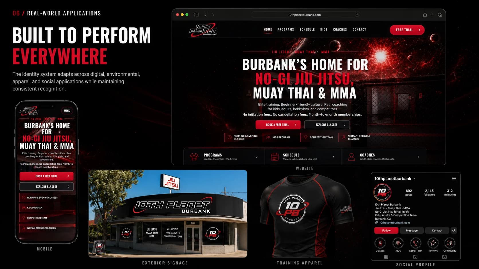
Visual Applications
A flexible identity prepared to carry one recognizable training culture across formats.
The identity is shown across the implemented website and visual application concepts for mobile, exterior signage, training apparel, and social profiles. These concepts illustrate the system’s intended range; they are not claims that each physical or social application is live.
Implemented Website
The current public website uses the completed identity system.
Application Concepts
Signage, apparel, and social views demonstrate intended system flexibility.
Consistent Recognition
Each format is designed to maintain a recognizable 10th Planet Burbank presence.
DEEP / CONTEXT
10th Planet Burbank Brand Identity & Logo System: project context and artifacts.
A refined logo identity and flexible mark system built to improve clarity, hierarchy, and recognizable use across 10th Planet Burbank’s digital and physical brand touchpoints.
Context and objective
The updated identity preserves recognizable 10th Planet character while improving clarity, balance, visual hierarchy, and versatility across larger-format applications.
Approach and key decisions
The identity replaces a more complex illustrated emblem with a consolidated silhouette: an integrated wordmark, a controlled Burbank location identifier, and an orbital device that reinforces movement and technical precision.
Outcome
The identity is shown across the implemented website and visual application concepts for mobile, exterior signage, training apparel, and social profiles. These concepts illustrate the system’s intended range; they are not claims that each physical or social application is live.
Services and artifacts
- Identity Direction
- Logo System
- Usage Standards
- Application Design
- Design Improvement
- Design Logic
- Logo System Variants
- Clear Space Standards
- Visual Applications
Need an identity system that works beyond the first impression?
Let’s build the mark, rules, and applications that keep a brand recognizable wherever it appears.